Introduction
Actions feature can be treated as navigation among dashboard’s states or between different dashboards. Actions allow quickly and easily configuring the transition to created state, transferring to other dashboards, or even updating the dashboard you are in. Depending on the widget, the action sources differ. However, the type of action you are able to choose will be the same for all widgets.
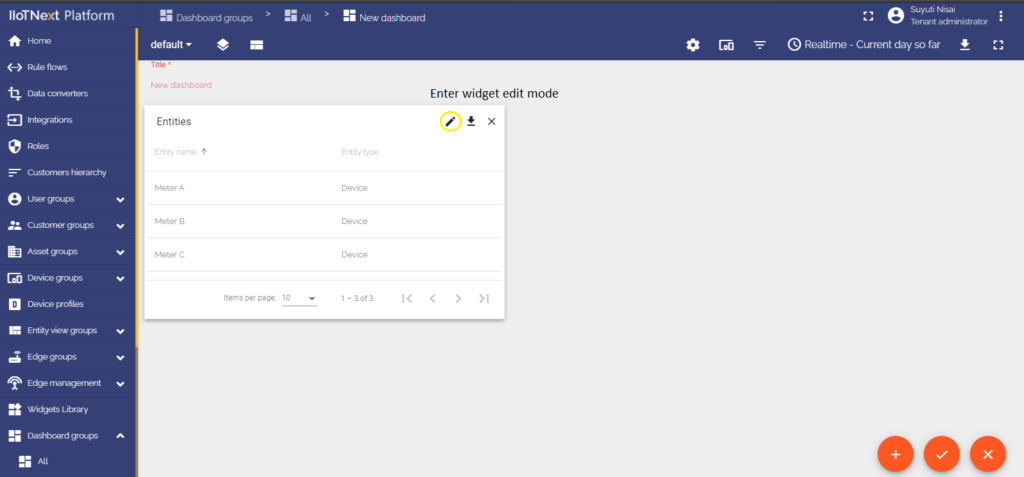
Actions are adjusted in the Edit mode of the needed widget.
To fully understand how to use Actions, you have to add a State to your widget. How to do this you should read here.
Action types
Types of action define which exactly action will be taken. There are five action types that are the same for all widgets. Learn how to configure action types with the example on Entity Cards widget examples.
Action types configuration
Since the action types are the same for all widgets, in this tutorial will be used the Action Cell Button action source to explain all action types, and they will be explained using the Entity Cards widget examples.
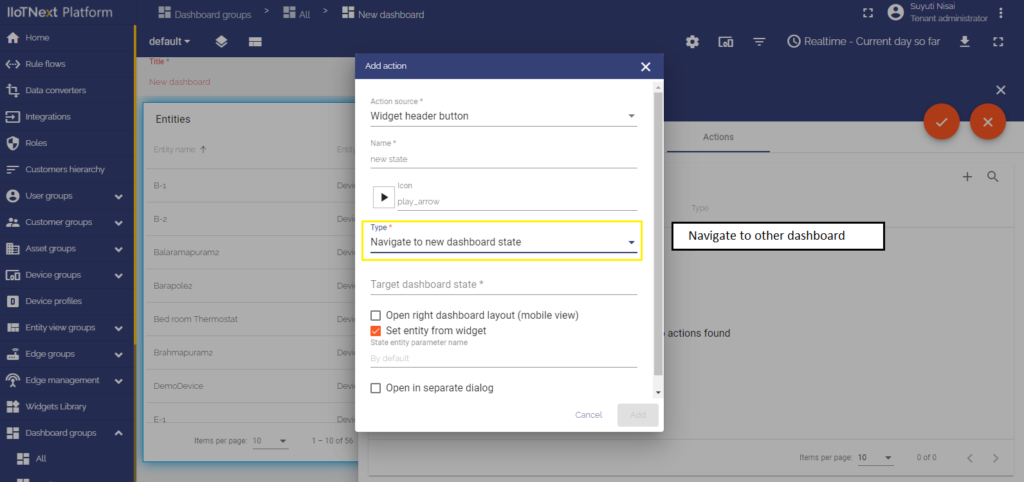
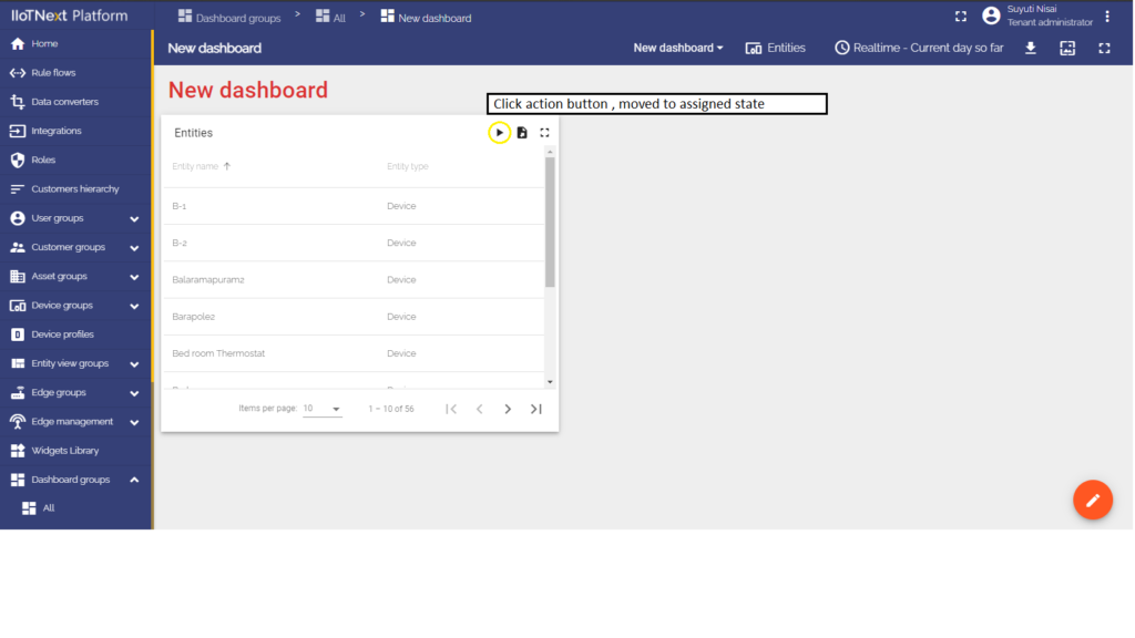
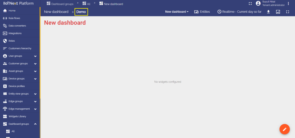
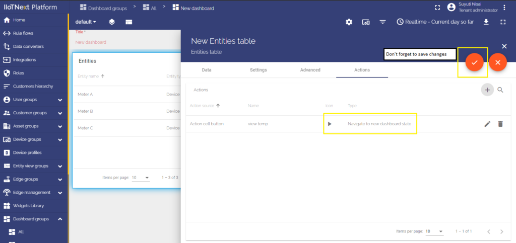
Navigate to new dashboard state
States are so-called levels that allow you to navigate between different devices, assets, and widget objects to see the information you need in more detail. When choosing the Navigate to new dashboard state action type, you will be transferred to the previously created state of your choice. How to add states to your dashboard, please read here.
After a state has been added, we can configure a Navigate to new dashboard state action type:
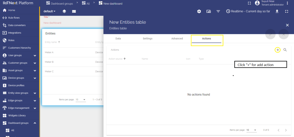
- In the widget’s Edit mode move to the last cell “Actions”.
- Click the “+” icon on the right of the window to add a new action.
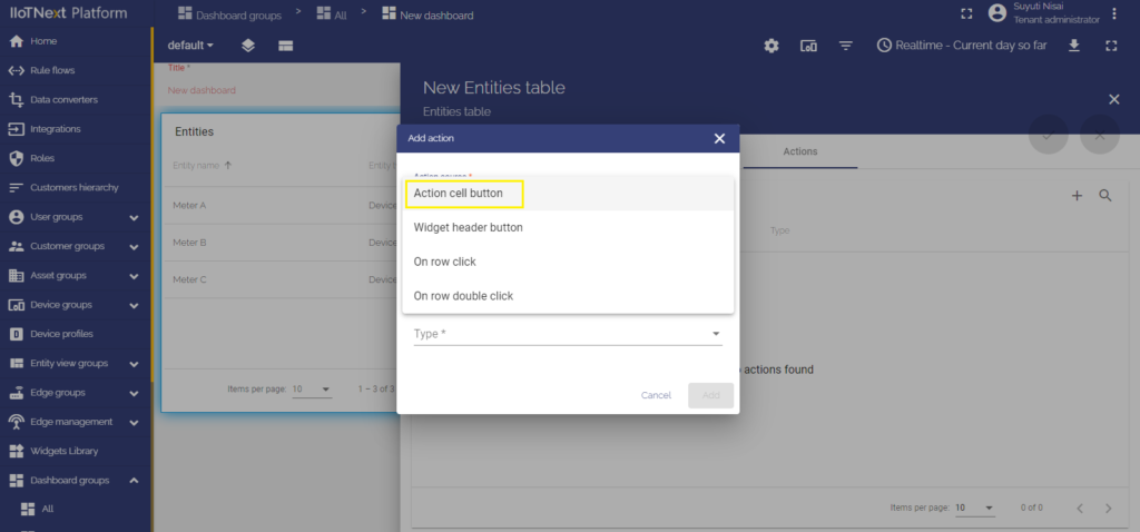
- As an example for this manual, in the top drop-down menu, choose an “Action cell button” action source.
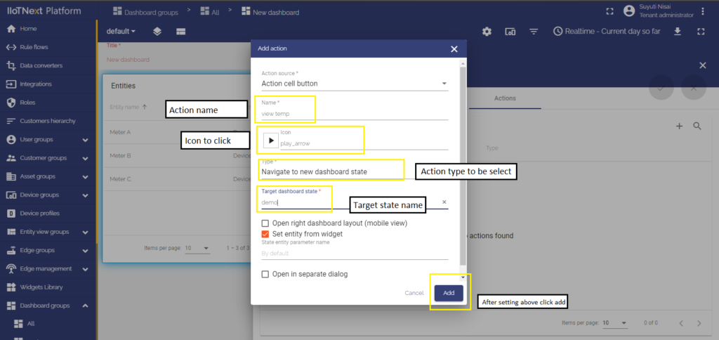
- In the next line input a name for the action and choose an icon that will represent a button. With this button, action will be performed.
- In the drop-down menu “Type”, choose a Navigate to new dashboard state action type.
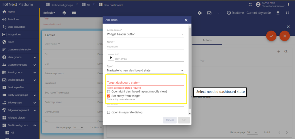
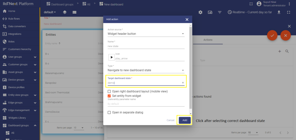
- After choosing an action type, the drop-down menu “Target dashboard state” appears. Select a previously created state you’d like to be transitioned to.
- When the desired state has been selected, click the “Add” button at the bottom of the “Add action” window.
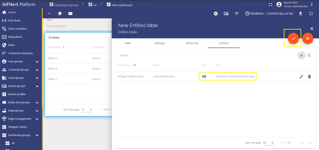
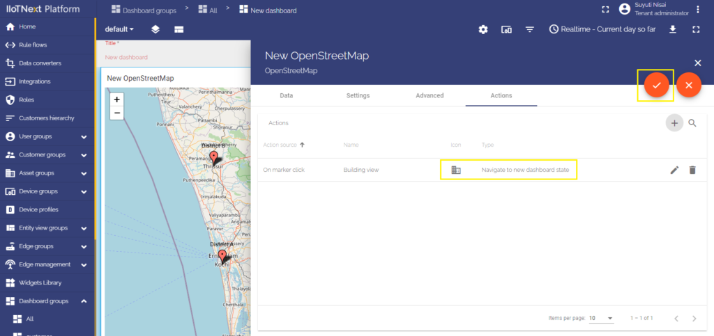
- Now you see configured action, so you can double-check action source, icon, and action type.
- Apply changes by clicking the orange tick icon in the top right of the window and then close the details window.
- Save applied changes by clicking the orange tick icon “Apply changes” in the bottom right of the screen.
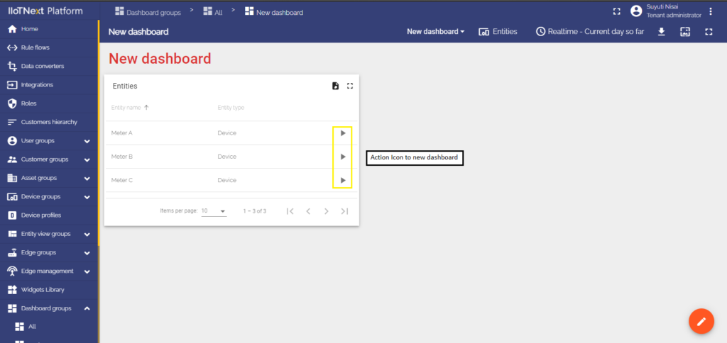
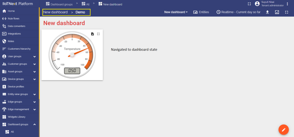
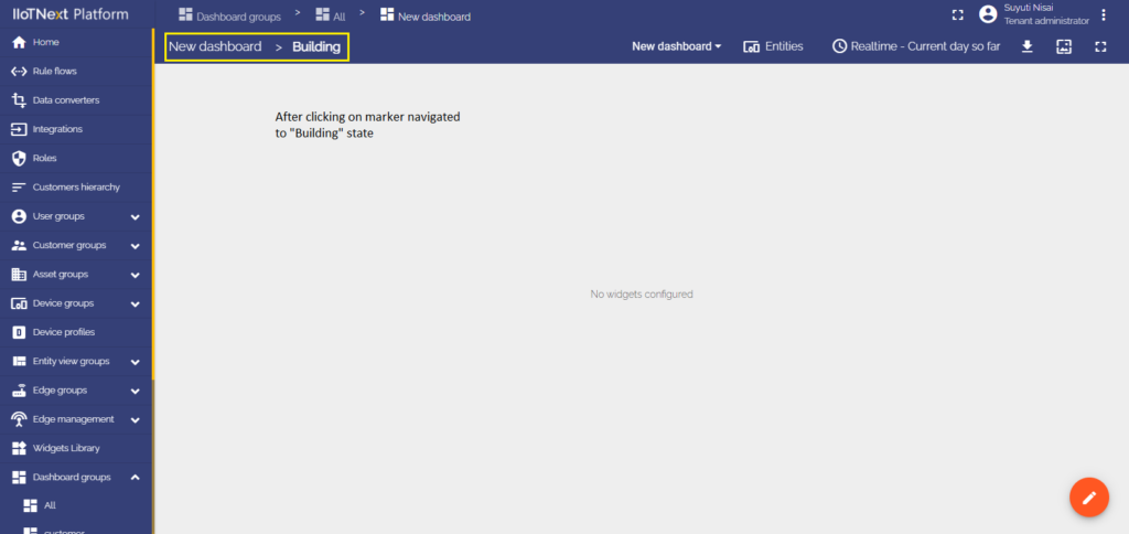
After saving changes, you can see an icon button opposite the entity names. Clicking any of these icons will bring you to the previously selected state.

Update current dashboard state
This action type allows updating a dashboard that you are currently on. While using a dashboard, you can view detailed information about a specific device/asset in real-time. The most common use of this action type is through Chart widgets where you can see the details more accurately. For starters let’s add a Chart widget to the Dashboard to configure the Update current dashboard state action type:
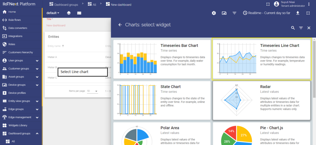
- Enter Dashboard’s Edit mode and in the drop-down “Select widget” menu choose Charts: Timeseries Line Chart.
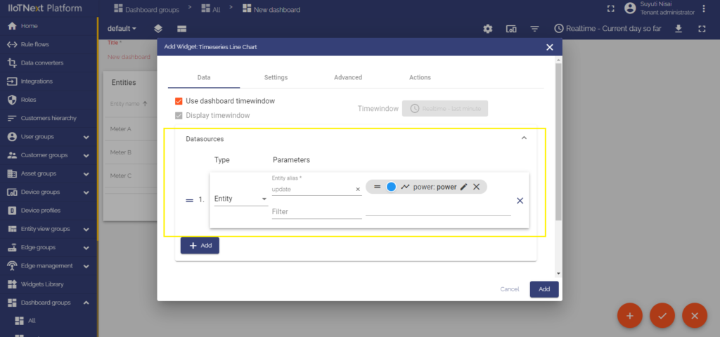
- In the “Add widget” window type input your data source, in this manual for example is used pressure data. Click “Add” at the right bottom of the widget.
- We can see that the Chart widget has appeared on the dashboard, but it has no data to display yet.
- Enter Edit mode of the Table widget by clicking the Pencil icon on the right top of the widget.
- In the widget’s Edit mode move to the last cell “Actions”.
- Click the “+” icon on the right of the window to add a new action.
- As an example for this manual, in the top drop-down menu, choose an “Action cell button” action source.
- In the next line input a name for the action and choose an icon that will represent a button. With this button, action will be performed.
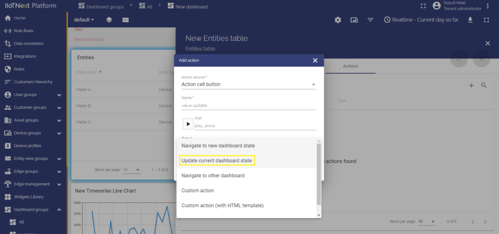
- In the drop-down menu “Type”, choose an Update current dashboard state action type.
- After choosing an action type, click “Add” at the right bottom of the “Add action” window.
- Now you see configured action, so you can double-check action source, icon, and action type.
- Apply changes by clicking the orange tick icon in the top right of the window and then close the details window.
- Save applied changes by clicking the orange tick icon “Apply changes” in the bottom right of the screen.
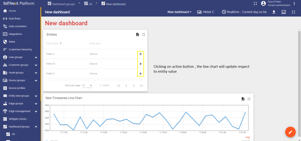
After saving changes, you will see button icons opposite the entity names. Clicking on any of these icons will update the entity details and they will be shown on the Chart widget on the current dashboard.

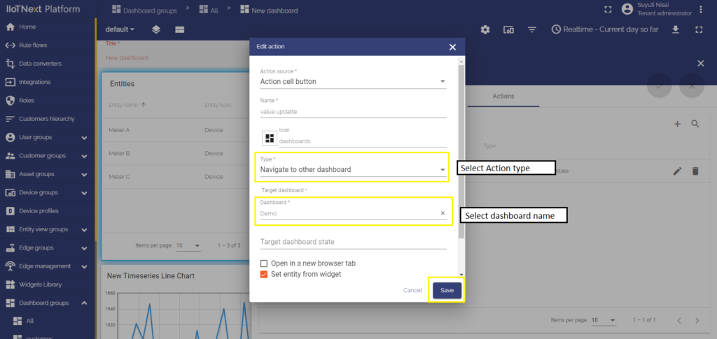
Navigate to other dashboards
This type of action transfers you to a previously created dashboard of your choice. To be fastly transitioned to another selected dashboard, you should:
- In the widget’s Edit mode move to the last cell “Actions”.
- Click the “+” icon on the right of the window to add a new action.
- As an example for this manual, in the top drop-down menu, choose an “Action cell button” action source.
- In the next line input a name for the action and choose an icon that will represent a button. With this button, action will be performed.
- In the drop-down menu “Type”, choose a Navigate to other dashboard action type.
- After choosing an action type, the drop-down menu “Target dashboard” appears. Select a previously created dashboard you’d like to be transitioned to. Notice that it’s also possible to be transitioned to the existing state in the chosen dashboard.
- After configuring an action type, click “Add” at the right bottom of the “Add action” window.
- Now you see configured action, so you can double-check action source, icon, and action type.
- Apply changes by clicking the orange tick icon in the top right of the window, and then close the details window.
- Save applied changes by clicking the orange tick icon “Apply changes” in the bottom right of the screen.
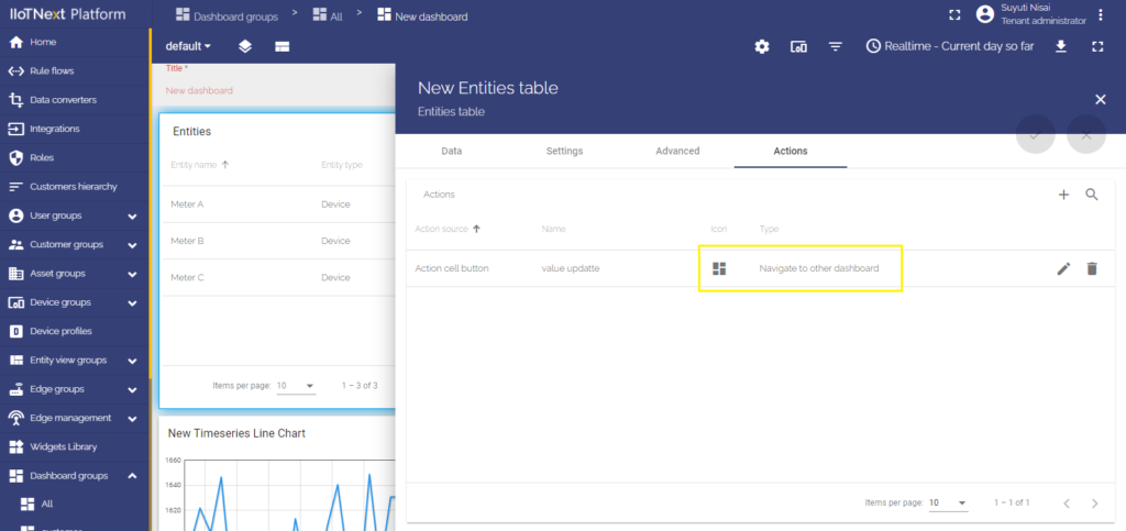
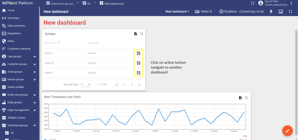
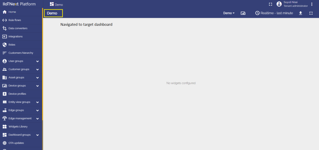
After saving changes, you can see icon buttons opposite the entity names. Clicking any of these icons will transfer you to the previously selected dashboard (or chosen state in that dashboard).
Action sources
Actions sources is a specific action that needs to be done to achieve a goal (like clicking a widget header button, double-clicking a row, or a map’s marker). Action sources are different for all widgets. Action sources will be explained for each widget type separately using an example of the most commonly used type of action “Navigate to new dashboard state”.
All of the action sources will be shown with an example of “Navigate to new dashboard state” action type.
Action sources configuration
For suitability, we consider action sources on the most commonly used widgets.
Please, learn here how to add an Entity Table widget to your dashboard.
To add an action to your Entity Table widget:
- Go to the Dashboard’s Edit mode;
- Click a “Pencil” icon in the upper right corner of the widget;
- Choose the last cell “Actions” and click the “Plus” symbol on the right of the window.
1. Action cell button
Clicking an icon that’s been chosen as a button executes an action. To configure the Action cell button action source, you should:
- In the widget’s Edit mode move to the last cell “Actions”.
- Click the “+” icon on the right of the window to add a new action.
- In the top drop-down menu, choose an Action cell button action source.
- In the next line input a name for the action and choose an icon that will represent a button. With this button, action will be performed.
- Since the example for all the action sources is the “Navigate to new dashboard state” action type, choose it in the drop-down Type menu.
- After choosing an action type, the drop-down menu “Target dashboard state” appears. Select a previously created state you’d like to be transitioned to.
- When all needed settings are configured, click “Add” at the right bottom of the “Add action” window.
- Now you see configured action, so you can double-check action source, icon, and action type.
- Apply changes by clicking the orange tick icon in the top right of the window and then close the details window.
- Save applied changes by clicking the orange tick icon “Apply changes” in the bottom right of the screen.
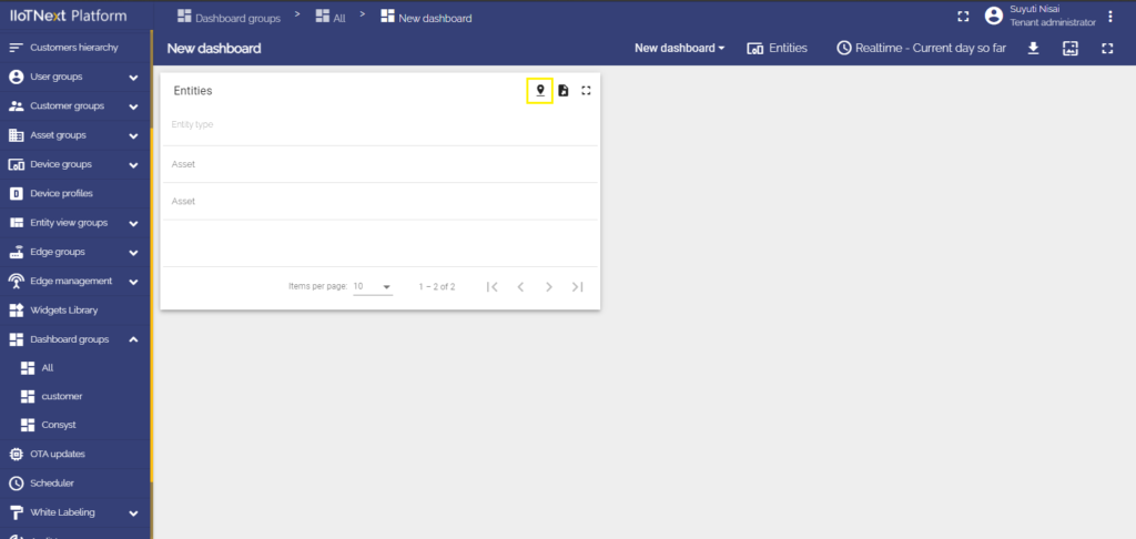
As you see, opposite each entity name is an action cell button. By clicking this button the action will be executed, namely transition to the chosen state.
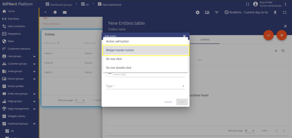
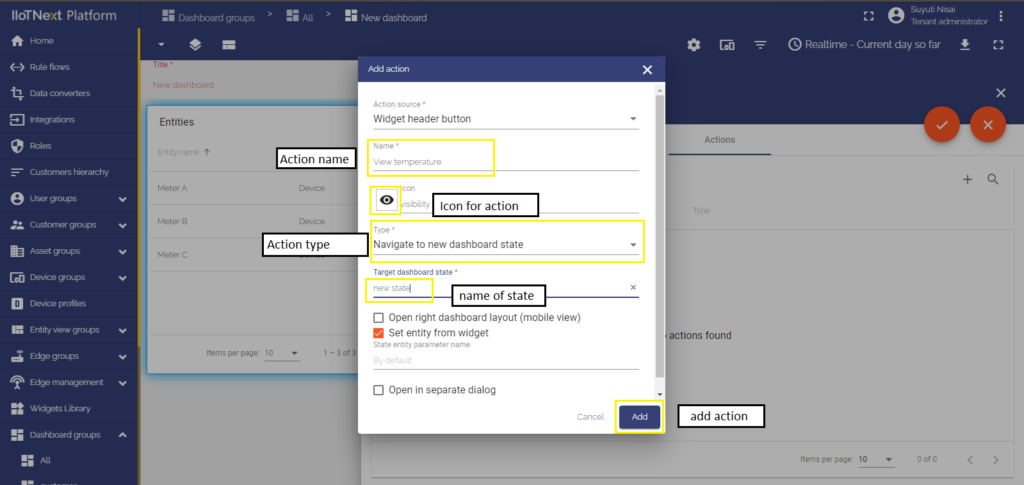
2. Widget header button
A button appears in the header of the widget. Clicking this button executes an action. This button is responsible for the whole widget, not for separate entities. The widget header button is the most commonly used action source, and it can be found in all widgets. To configure the Widget header button action source, you should:
- In the widget’s Edit mode move to the last cell “Actions”.
- Click the “+” icon on the right of the window to add a new action.
- In the top drop-down menu, choose a Widget header button action source.
- In the next line input a name for the action and choose an icon that will represent a button. With this button, action will be performed.
- Since the example for all the action sources is the “Navigate to new dashboard state” action type, choose it in the drop-down Type menu.
- After choosing an action type, the drop-down menu “Target dashboard state” appears. Select a previously created state you’d like to be transitioned to.
- When all needed settings are configured, click “Add” at the right bottom of the “Add action” window.
- Now you see configured action, so you can double-check action source, icon, and action type.
- Apply changes by clicking the orange tick icon in the top right of the window and then close the details window.
- Save applied changes by clicking the orange tick icon “Apply changes” in the bottom right of the screen.
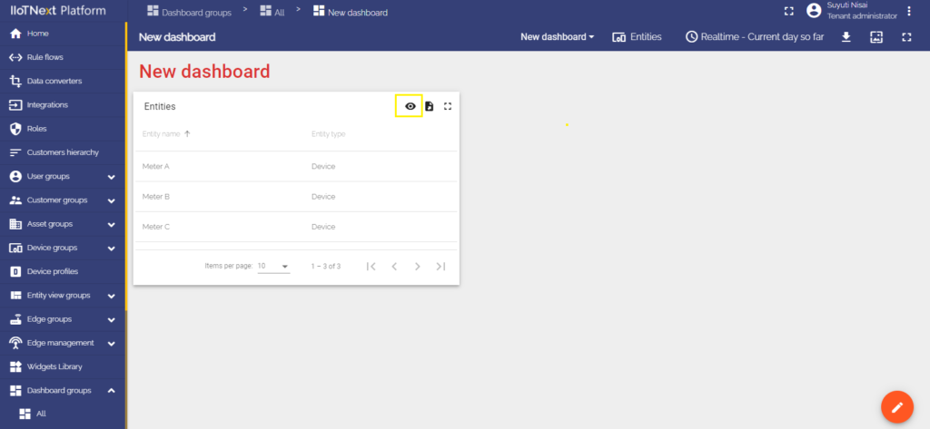
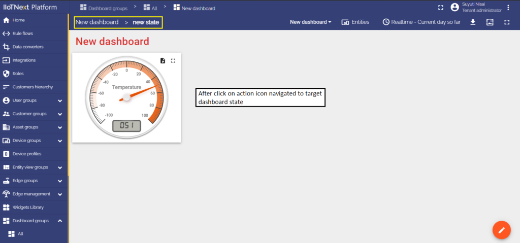
As you see now, in the header of the widget has appeared a button-icon. After you click it, action will be performed, namely, the transition to the chosen state.
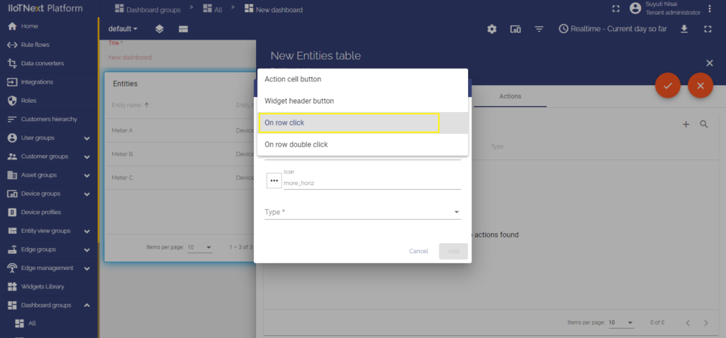
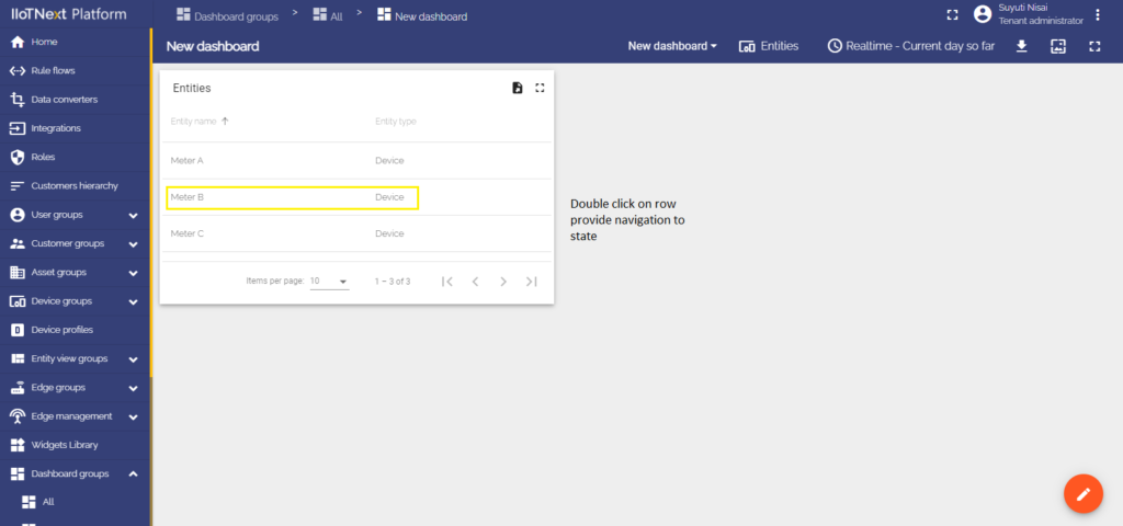
3. On row click
Clicking on the row of the Table widget executes an action. To configure the On row click action source, you should:
- In the widget’s Edit mode move to the last cell “Actions”.
- Click the “+” icon on the right of the window to add a new action.
- In the top drop-down menu, choose an On row click action source.
- Enter the name of the action in the appropriate line.
- Using this action source, there won’t be any buttons on the widget, therefore we shouldn’t select an icon.
- Since the example for all the action sources is the “Navigate to new dashboard state” action type, choose it in the drop-down Type menu.
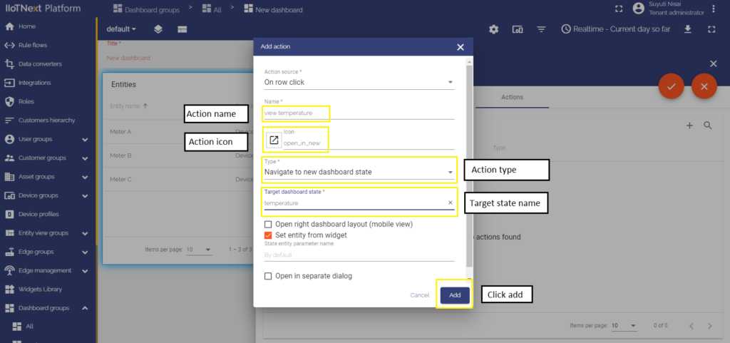
- After choosing an action type, the drop-down menu “Target dashboard state” appears. Select a previously created state you’d like to be transitioned to.
- When all needed settings are configured, click “Add” at the right bottom of the “Add action” window.
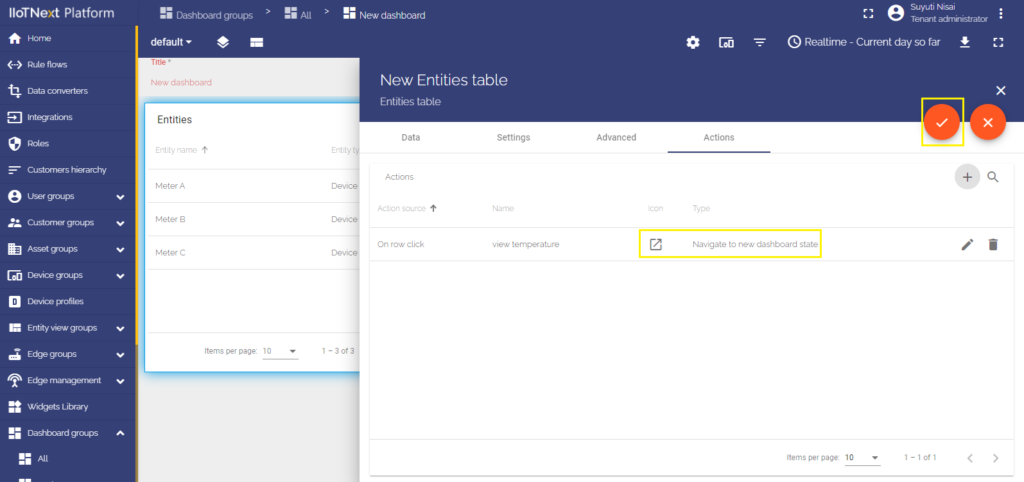
- Now, you see configured action, so you can double-check action source and action type.
- Apply changes by clicking the orange tick icon in the top right of the window and then close the details window.
- Save applied changes by clicking the orange tick icon “Apply changes” in the bottom right of the screen.
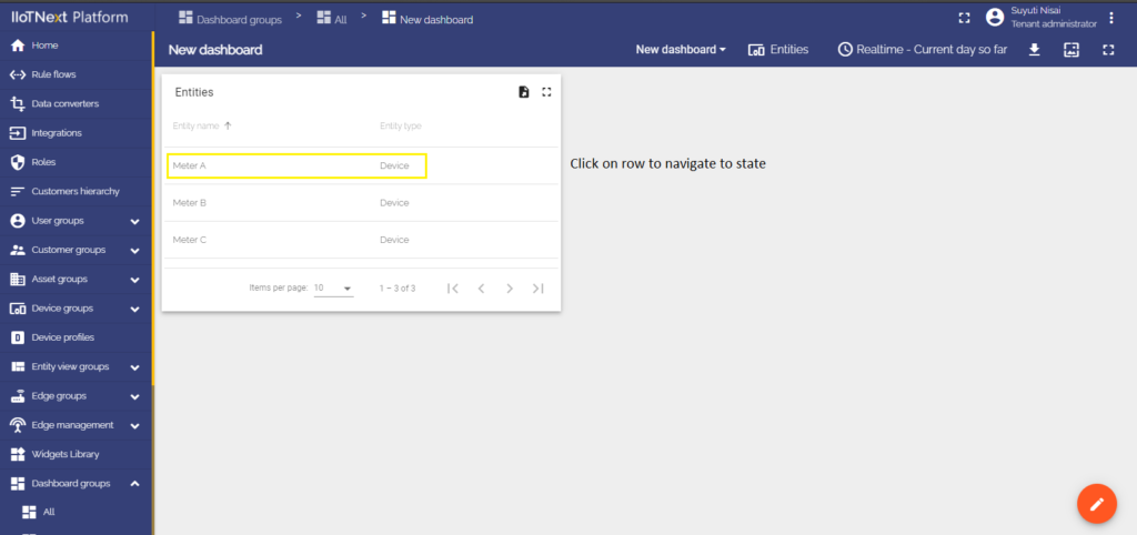
To execute an action, namely to be transitioned to the chosen state, just click any of the rows of your Table widget.
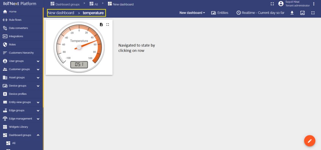
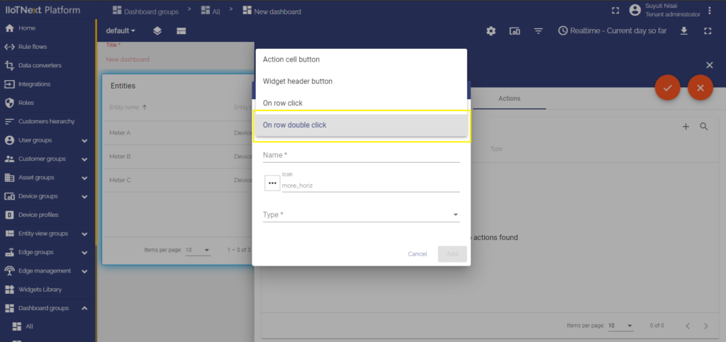
4. On row double click
Double-clicking any row of the Entity table widget executes an action. To configure the On row double click action source, you should:
- In the widget’s Edit mode move to the last cell “Actions”.
- Click the “+” icon on the right of the window to add a new action.
- In the top drop-down menu, choose an On row double click action source.
- Enter the name of the action in the appropriate line.
- Using this action source, there won’t be any buttons on the widget, therefore we shouldn’t select an icon.
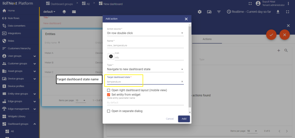
- Since the example for all the action sources is the “Navigate to new dashboard state” action type, choose it in the drop-down Type menu.
- After choosing an action type, the drop-down menu “Target dashboard state” appears. Select a previously created state you’d like to be transitioned to.
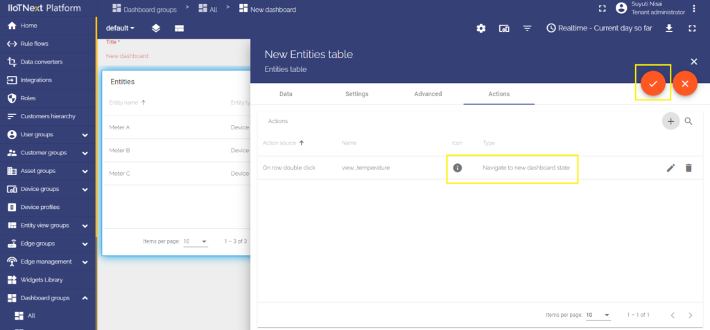
- When all needed settings are configured, click “Add” at the right bottom of the “Add action” window.
- Now, you see configured action, so you can double-check action source and action type.
- Apply changes by clicking the orange tick icon in the top right of the window and then close the details window.
- Save applied changes by clicking the orange tick icon “Apply changes” in the bottom right of the screen.
To execute an action, namely to be transitioned to the chosen state, just double-click any of the rows of your Table widget.
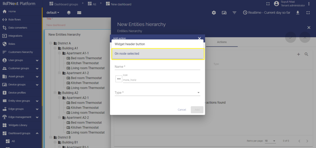
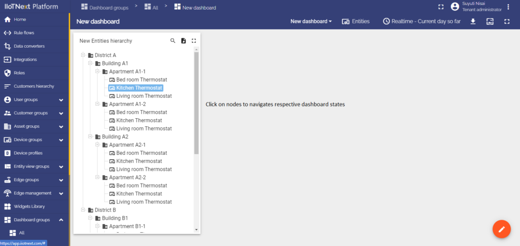
5. On node selected (only in Entities Hierarchy widget)
When the Entities Hierarchy widget was added, you should configure a hierarchy itself. How to do it, please, learn here. After relations were added, go to the Edit mode of the Entities Hierarchy widget. To configure the On node selected action source:
- In the widget’s Edit mode move to the last cell called “Actions”.
- Click the “+” icon on the right of the window to add a new action.
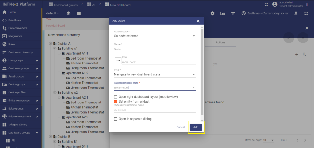
- In the top drop-down menu, choose an On node selected action source.
- Since the example for all the action sources is the “Navigate to new dashboard state” action type, choose it in the drop-down Type menu.
- After choosing an action type, the drop-down menu “Target dashboard state” appears. Select a previously created state you’d like to be transitioned to.
- After configuring all needed settings, click “Add” at the right bottom of the “Add action” window.
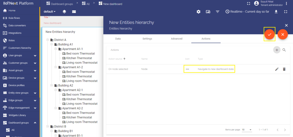
- Now you see configured action, so you can double-check action source and action type.
- Apply changes by clicking the orange tick icon in the top right of the window and then close the details window.
- Save applied changes by clicking the orange tick icon “Apply changes” in the bottom right of the screen.
To perform an action you should click any of the nodes in the Entities hierarchy.
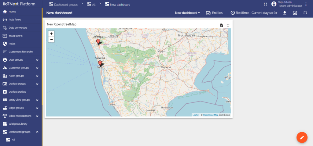
Map widget action sources
The map widget has unique action sources that need to be considered separately.
Let’s start by adding a Map widget. Go to the dashboard where your Map will be placed and click a bottom right “Pencil” icon:
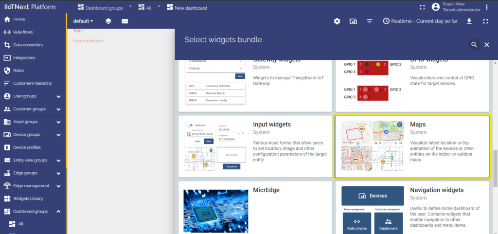
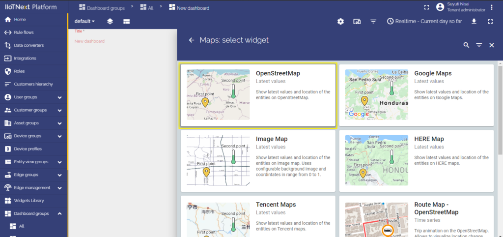
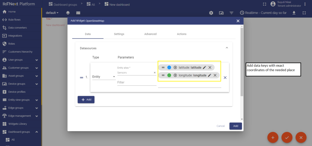
- If you have an empty new dashboard, you need to just click the message in the middle “Add a new widget” and in the drop-down menu at the end of the list, choose “Maps”. Then, add a Datasource of your widget and click “Add”.
- If some widgets were added before to this dashboard, click the “Paper” icon (“Create new widget”). In the drop-down menu list to the end of the list to choose “Maps”. Finally, add a Datasource of your widget and click “Add”.
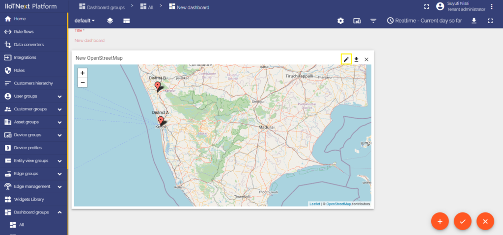
- Adding an action to the Map widget
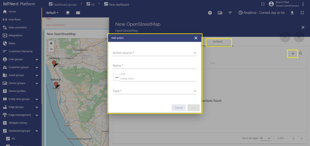
Now it’s time to add an action. To do this you should click the “Pencil” icon on the right top of the Map widget to enter the “Edit widget” mode. Navigate to the “Action” cell and there click the “+” icon in the right of the screen. The “Add action” window will be opened.
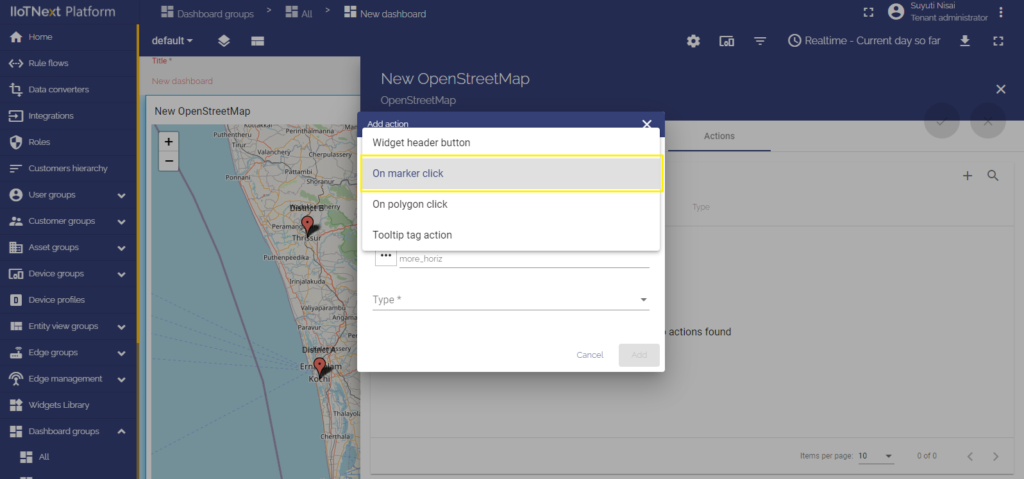
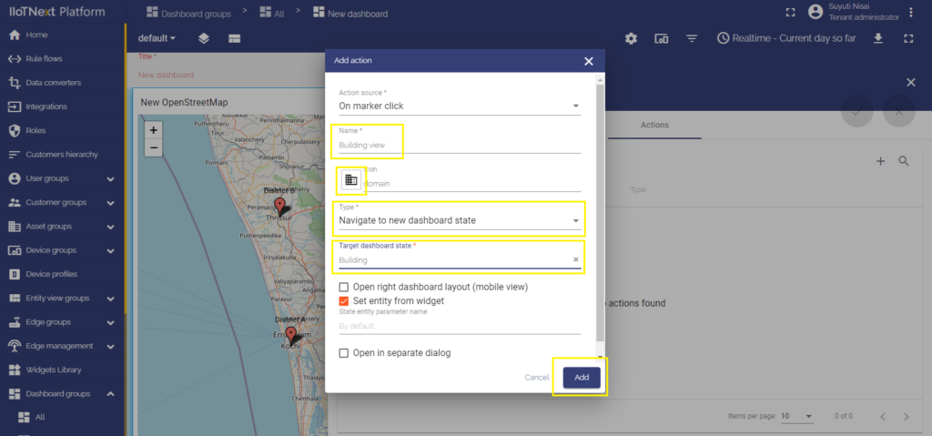
1. On marker click
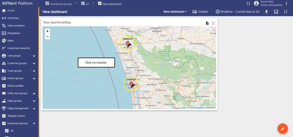
Action will be executed by clicking on the red map’s marker.
- In the widget’s Edit mode move to the last cell “Actions”.
- Click the “+” icon on the right of the window to add a new action.
- In the top drop-down menu, choose an On marker click action source.
- Since the example for all the action sources is the “Navigate to new dashboard state” action type, choose it in the drop-down Type menu.
- After choosing an action type, the drop-down menu “Target dashboard state” appears. Select a previously created state you’d like to be transitioned to.
- When all needed settings are configured, click “Add” at the right bottom of the “Add action” window.
- Now you see configured action, so you can double-check action source, icon, and action type.
- Apply changes by clicking the orange tick icon in the top right of the window and then close the details window.
- Save applied changes by clicking the orange tick icon “Apply changes” in the bottom right of the screen.
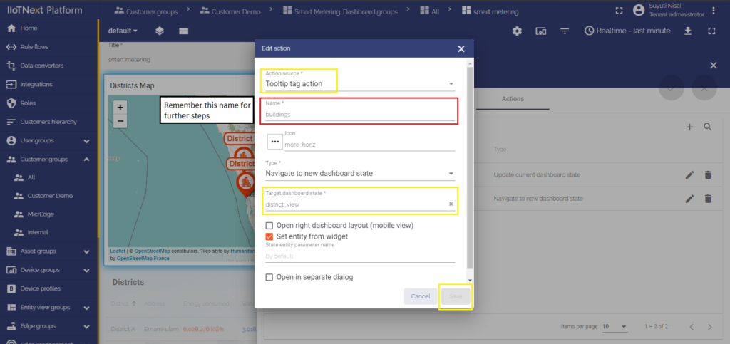
2. Tooltip tag action
When clicking a map’s marker, a tooltip will appear. A tooltip contains a link that executes an action. Please note, in this manual explained a basic way to use the tooltip tag action source. It is possible to configure several links for various devices/assets that return different values. Do it with the tooltip function in the advanced mode of the map widget.
To configure the Tooltip tag action of the Map widget, you should:
- In the widget’s Edit mode move to the last cell “Actions”.
- Click the “+” icon on the right of the window to add a new action.
- In the top drop-down menu, choose an On marker click action source.
- Enter a name for the action and make sure to remember it, it’s going to be used later.
- Since the example for all the action sources is the “Navigate to new dashboard state” action type, choose it in the drop-down Type menu.
- After choosing an action type, the drop-down menu “Target dashboard state” appears. Select a previously created state you’d like to be transitioned to.
- When all needed settings are configured, click “Add” at the right bottom of the “Add action” window.
- Now you see configured action, so you can double-check action source, icon, and action type.
- Apply changes by clicking the orange tick icon in the top right of the window and then close the details window.
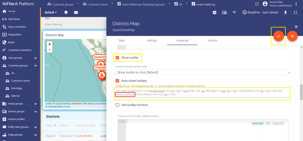
- Move to the Advanced settings cell.
- Scroll down to the Tooltip configuration and tick the checkbox “Show tooltip”.
- In the Tooltip line find the link-act name and input there the action name in a format:
<link-act name='TooltipTag'>Navigate to the Building A</link-act>
where TooltipTag is an action name and Navigate to the Building A is the text that will be shown as a link on a tooltip.
- Apply changes by clicking the orange tick icon in the top right of the window and then close the details window.
- Save applied changes by clicking the orange at the right bottom of the screen.
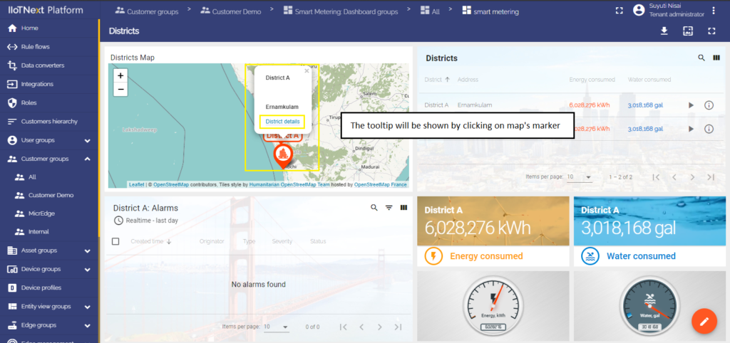
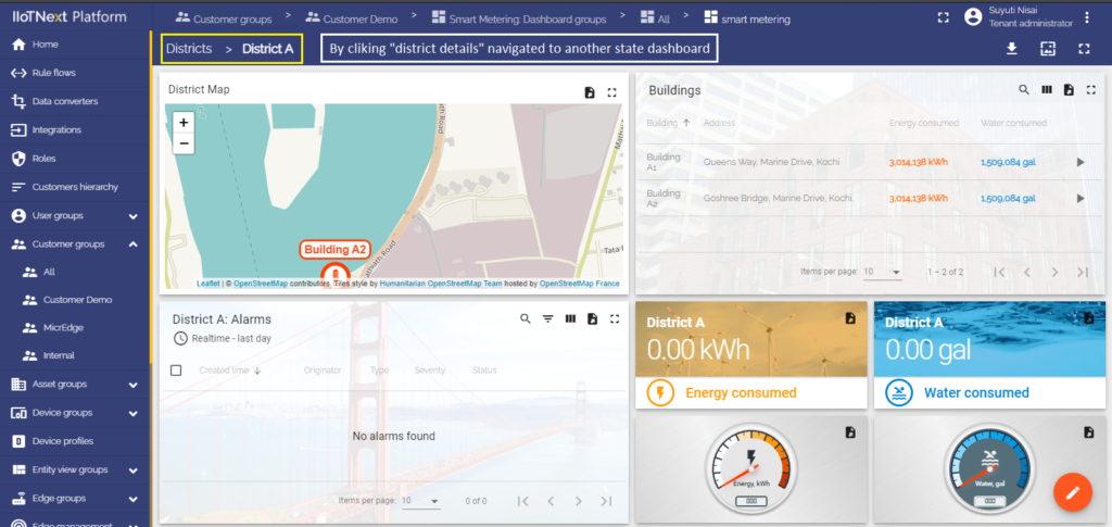
Click a map marker for a tooltip to appear. To execute an action, click the text of the link at the bottom of the tooltip.
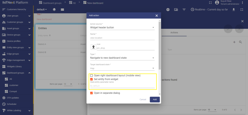
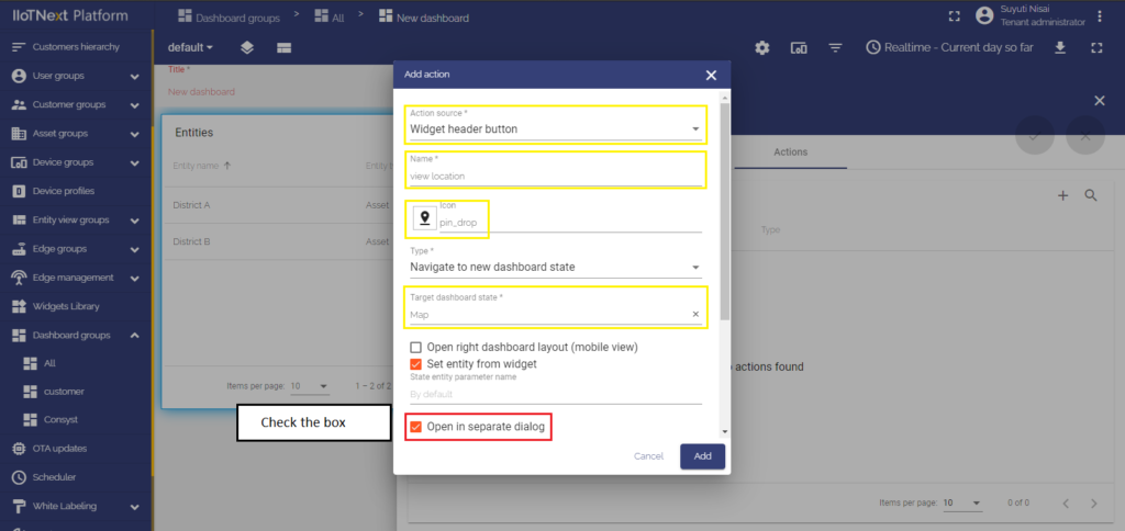
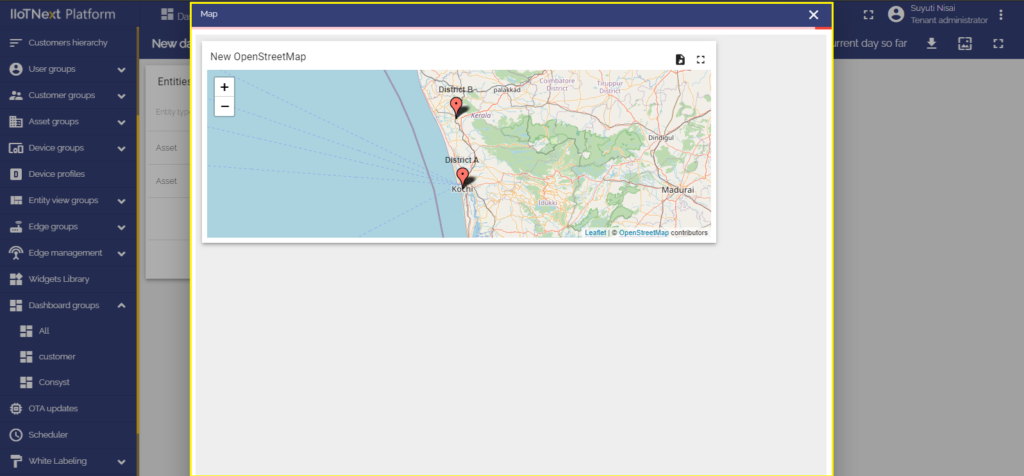
Open in a separate dialog
There are times when it is impractical to move to a separate dashboard state to view the details of a widget, but you just would like to open it on the same dashboard page. For these situations, there is an Open in a separate dialog feature that allows opening another state on the same page using a configured action. To open a state in a separate dialog window on the dashboard you are in, you should:
- Enter the Dashboard’s Edit mode by clicking a “Pencil” icon at the right bottom of the page.
- First, we need to add a new state, so click the “Manage dashboard states” button on the left top of the dashboard.
- In the opened window, click the “+” icon to add a new state. What is a state and how to configure it, please, learn here.
- After adding a state, click the “Save” button at the right bottom of the “Manage dashboard states” window.
- Now, enter widget Edit mode by clicking the “Pencil” icon on the right top of the widget.
- Go to the “Actions” cell and click the “+” icon to add a new action.
- Choose the desired action source, in the example, it is going to be the Action cell button. Give a name for the action. Select an icon representing a button by clicking an icon image and choosing from the variety of icons.
- From the drop-down menu select a “Navigate to new dashboard” action type, and a target state, the one that was created in step 3.
- Tick the check box “Open in separate dialog” and give a title to a dialog.
- By default, the checkbox “Hide dashboard toolbar in dialog” is ticked. If you need to see a toolbar in the dialog window, you should uncheck it. The toolbar displays entities, time window, dashboard export button, and expand to a fullscreen button.
- It is optional to adjust a dialog width and height in percents. Width is relative to viewport height, and height is relative to width correspondingly.
- When the action has been configured, click on the “Add” button at the right bottom of the “Add action” window.
- When the action has been added, double-check the action source, icon, and action type. If everything is correct, click the orange tick mark on the right top of the page.
- Go to a newly created yet empty state and click “Add new widget” in the middle of the screen.
- From the drop-down menu “Current bundle”, select the desired widget, in our example, it is going to be map widget “OpenStreetMap”.
- Add data sources and click “Add”.
- A widget has been added on the dashboard state, drag its edges to adjust the size.
- When adjusted, click the orange tick at the left bottom of the screen to save applied changes.

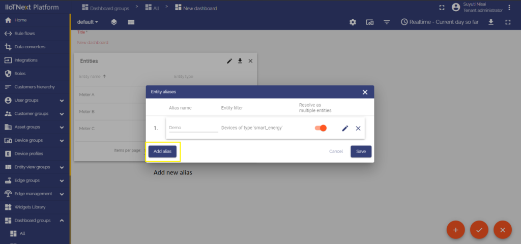
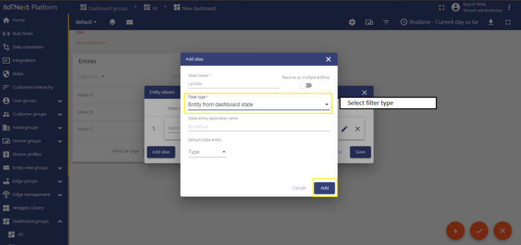
Set entity from the widget
Set entity from widget checkbox is responsible for adding specific entity from the widget to the state. This allows you to use the entity in the target dashboard state by creating the “Entity from dashboard state” or other aliases. For example, if you have a list of devices in the table widget and would like to show specific device details when you click on the table row.
Sometimes you need to store more than one entity in the state. For example, you would like to navigate to the customer list, then to the devices of the customer and finally to specific device details. In such a case, you may have three states: “Main”, “Customer Devices” and “Device Details”. You may use two different state entity parameters to reference the current customer (e.g. “current customer”) and current device (e.g. “current device”) on the “Device Details” state.